
Most of what an electrical contractor website redesign fixes never shows up in a screenshot. The colors change and the photos get bigger. The part that moves the needle is quieter: a phone number that dials when a homeowner taps it, a page that knows how wide a phone screen is, a footer that does not announce the business stopped paying attention in 2013.
The before-and-after below is anonymized and drawn at the pattern level from the 37 reproducible audits in our current corpus on Tampa Bay area contractor and home-service sites. We do not publish client names without consent, so we describe what the rebuild looks like rather than whose site it was. Every figure comes from that audit set.
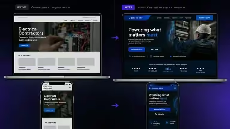
The before: five problems, none of them cosmetic
The pattern on a dated electrician homepage is consistent, and it is almost never one broken thing. It is a stack of small ones that accumulated over a decade because nobody had a reason to look.
The phone number sits in the header as plain text. It looks like a link and behaves like a paragraph. Missing click-to-call showed up on 35% of the sites in our audit set, and it is the defect we would fix first, because it is the only one that stops a ready customer from acting at all. Everything else makes a business look dated. This one makes it unreachable.
The footer copyright year is behind the current one, sometimes by a decade. That appeared on 41% of the sites we audited, and it is the fastest way for a homeowner to conclude a business might not exist anymore.
The logo has no clean version. This is the most common finding in the whole set: 76% of audited sites had a logo scoring below 65 on usability, meaning it breaks apart at small sizes, vanishes against a dark header, or has no version crisp enough for a favicon or a map pin. On 49% the logo also read as visually dated.
There is no viewport meta tag. This one is invisible to the owner and brutal for the visitor: without it, a mobile browser is never told to render the page at phone width, so it serves a shrunken desktop layout that has to be pinched and dragged to read. It appeared on 5% of the set and carries the heaviest penalty in our rubric.
The homepage says almost nothing. Nineteen percent of the sites had fewer than 200 visible words, which leaves neither a homeowner nor a search engine much to work with. On a service business that usually means the panel upgrades, generator installs, and troubleshooting work that pays the bills are nowhere on the page.
What the audit score said
Across the 37 reproducible audits, the median score is 23 out of 100. A site carrying the stack described above lands near that midpoint, which suggests accumulated maintenance and usability work rather than proving that every typical contractor site needs a ground-up rebuild.
The ratings say the same thing another way. Of the 37 sites, 2 came back HOT, 12 WARM, 11 COOL, and 12 LOW. Twenty-three sites were in the lower-need COOL or LOW bands, while fourteen were HOT or WARM. Only one site, about 3%, was still served over plain HTTP, which browsers flag directly to visitors.
The after: what an electrical contractor website redesign actually changes
The rebuild does the boring things first, because the boring things are what convert.
Every instance of the phone number becomes a real tel: link, in the header, the footer, and on the contact page. That last part matters. We regularly see sites where the fix was applied once at the top and missed everywhere else, so half the taps still go nowhere.
The viewport meta tag goes in and the layout becomes responsive for real, not a desktop page scaled down. Pinch-zoom stays enabled, since blocking it locks out anyone who needs to enlarge text. It was blocked on 5% of audited sites.
The logo gets reworked, not replaced. Same identity, same colors, redrawn so it holds together at favicon size and on a dark background. Contractors often brace for us to talk them into a new brand. We are not trying to.
The homepage gets actual content: services offered, areas served, licensing, and the reasons a homeowner in Clearwater would call this electrician instead of the next one. Template placeholder text, found on 32% of audited sites, comes out entirely. So does every dead hash-only link, present on 8% of the set.
What we did not measure, and will not claim
Here is where a case study usually reaches for a number, and where we have to be straight with you. We do not measure page load speed, and we do not check whether a contact form actually delivers mail. Neither is in our audit rubric, so we have no data on either and will not pretend otherwise.
We also cannot tell you how many additional calls a rebuild produced, because we do not have access to a client's call logs. What we can say is which defects were present before and absent after, because those are observable facts about the page. The rest is inference, and we would rather label it as such than dress it up as a result.
What a rebuild like this costs
A site of five pages or fewer carrying the stack described above is what our Skim Refresh package at $2,500 is built for. It covers the functional fixes and the surface modernization together, which matters because fixing the tel: link on a site that still looks like 2012 leaves the trust problem intact.
A larger site, 10 to 15 pages with real service-area and project content, is a Fresh Pour at $5,500. If a business needs booking, e-commerce, or genuinely custom work, that is a Whole Carton, starting at $12,000. After launch, care plans run $3.95, $79, $189, or $399 per month depending on how much attention the site needs.
The honest read: if your site has three or more of the problems in the before list, the cheapest thing you can do today is check the phone number on your own phone. Everything past that is a budget conversation. More teardowns like this one are on our news section.
See the direction before the rebuild
SiteMilk offers a free before-and-after homepage mockup so you can judge the modernization direction before committing anything. Start in the homepage contact section or email milkman@sitemilk.com.
Same brand. Modern build. Fresh pour.
Frequently asked questions
How long does an electrical contractor website redesign take?
For a five-page site in the Skim Refresh range, the work itself takes weeks rather than months. The slow part is usually not the build. It is collecting photos, license numbers, service-area details, and the copy only the owner can supply. Contractors who have that material ready move considerably faster.
Will a redesign mean losing the logo and brand we already have?
No, and we would push back if that were the ask. Logo usability was the most common finding in our 37-site audit set at 76%, but the fix is almost always redrawing the existing mark so it reproduces cleanly at small sizes and on dark backgrounds, not designing a new identity. The recognition a local business has built is an asset.
Can we just fix the phone number and skip the rest?
You can, and if the phone number is the only real problem, you should. Adding a tel: link is minutes of work. In practice it rarely travels alone: in our data it clusters with stale copyright years, missing viewport tags, and dated builder signatures on sites nobody has touched in years. When four or five are stacked together, patching one line of code leaves the visitor with the same impression they had before.